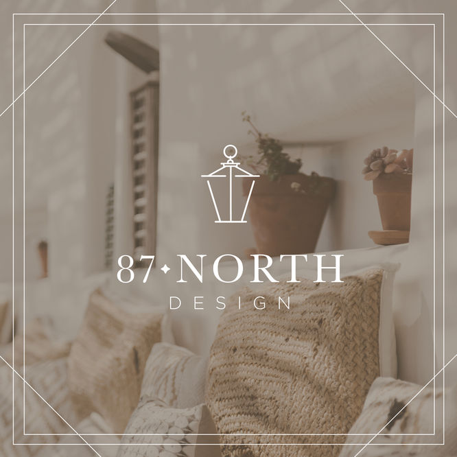
87 North Design
87 North Design was looking to create a branding & website experience that made their audience feel peace and renewal as they looked for a home or furnished their space. The identity represents transformation, timelessness, comfort, warmth, fellowship, stability, and innocence.
Service
Client
Branding Identity
87 North Design
Year
2020


The Primary Mark
The primary mark uses a serif font paired with a sans serif font. The diamond shape after 87 alludes to a compass giving a level of depth and character to the mark.
The lantern mark was designed to compliment the typography and to give feelings of warmth, comfort and fellowship.

The
Secondary Mark
The secondary mark is to be used in situations where the primary mark may not translate as well. It is another variation of the primary mark and can be used on print or digital collateral.

What is a "Mini Mark?"
We designed a mini mark that was intended to be used in spaces where the primary and secondary mark may not be legible. The mini mark is a simplified version of the primary mark and can be useful for social media platforms or at times when you need a small scaled logo.
Recent Work
The
Website
We strived to create a website that felt professional, welcoming, and high-end. The goal of the site was to showcase previous work and give a sense of credibility. User experience was on top priority for both desktop and mobile.


